Infographics
Aboriginal population
Get infographic now
(immediate download, PDF, 1.3 MB)
2% or 3%? Remote or urban? NT or NSW? Aboriginal population statistics are confusing.
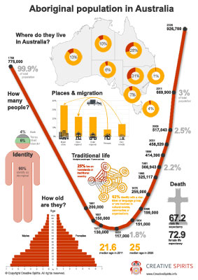
Many don’t even know the correct facts about Aboriginal Australian population today. This infographic helps correct the many stereotypes still used, even by the media.
Use this striking population curve taking centre stage to illustrate that there is still a way to go until pre-invasion population levels are reached. Show that most Aboriginal people live in New South Wales and major cities, not in the Northern Territory or remote outback.
This infographic is ideal to correct false facts about Aboriginal population figures:
- learn where Aboriginal Australians live in this country,
- see how many Aboriginal people migrate from remote into urban and regional spaces,
- explore how their population pyramid differs from that of non-Aboriginal people, and
- learn the shocking numbers of life expectancy and average age of death.
FREE companion guide with background explanations, a full table of population data and all data sources.
Get this engaging infographic pack as a high-resolution PDF ready to be printed in A4 or A3.
Bulk discount available, please ask.
"Another fantastic resource!" —Paula, via Facebook
